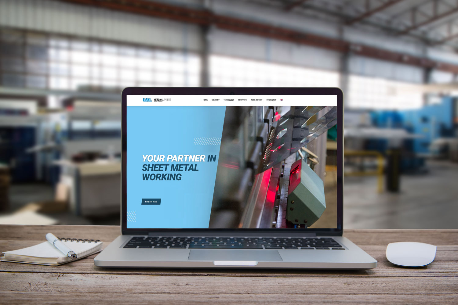
Change and dynamism are the key factors in remaining competitive in the market and to always offer customers a timely turnaround for their company. For this reason, Verona Lamiere has decided to review its entire company website in terms of design, quality and technology. Having undergone a complete transformation in terms of content and layout, the new website displays the brand’s restyling and all promotional material related to it. The interface created enhances the company’s instinctive design process, in which the critical factors are the innovation which characterises the company and the attention given to each customer.
The site has been created following a clean and clear design style, in order to welcome the visitor, while also communicating a strong sense of solidity and trust, elements at the heart of every project undertaken. The history of Verona Lamiere began in the 1990s and has found its way to success through linear expansion, always putting customer satisfaction and the excellence of processes and products first.
There is a clean and clear design highlighting the company’s results and welcomes visitors with a strong sense of solidity and trust, on which each project’s foundation can be developed and achieve the desired results.
White, light blue and blue are the colours used by Verona Lamiere as a brand and for all communication, restructuring the multimedia elements and rediscovering the fresh and innovative identity that has distinguished the company since its creation.
It is a story of a company that began in the 90s and that has found its way to success through linear expansion, up until standing out in the market for customer satisfaction and operational excellence.

